
One of the enriching outcome of Teaching is that you get to Learn more by some of the thoughtful questions that come from the students.
Yesterday in my class on Visual Storytelling at ACJ, I was talking about the pre-attentive attributes and showing the class some great visual stories with color, when one of the student posed this question – “All these are great, but, if I am working for a news paper that is not flush with colorful graphics, how would I go about it?”
To quote the American designer Paul Rand, the acclaimed creator of corporate logos like IBM, UPS among others,
If a design doesn’t make sense in black and white, it will make less sense when color is added.
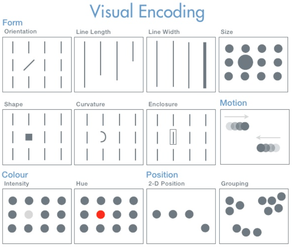
For starters, a pre-attentive attribute is one that is processed in the spatial memory, without any conscious effort and that enhances the visual perception. The goal of effective visual storytelling is to harness these attributes so that they enhance the delivery of insights.
Going back to the question on creating effective visual stories in grayscale for the Print medium, there are numerous ways to achieve that. You create a visualization because you want to provide clarity and insights on the quantitative data. Most of us would be tempted to sprinkle the work with colors we like, especially given the meteoric rise of digital medium as the primary delivery channel for information. Color is just a tool and it should not be the starting point in a storytelling process. Instead, focus more on the sensemaking process. As noted by Colin Ware in his work Visual Thinking for Design, Color is just one of the pre-attentive attribute that enhances the visual perception. You can still effectively leverage the other attributes related to Form, Movement and Spatial Positioning for your visual stories.
There are also other effective ways to present charts in grayscale. Below are some general tips.
- Remove clutter and improve data-ink ratio with no background color.
- Effective usage of an appropriate grayscale color palette. Tableau has few of them.
- Make sure you test it out in Print so that you don’t end up with something like this.
- Find ways to highlight key items with meaningful Annotations and Enclosures.
- Follow all the golden rules of communicating with numbers by Stephen Few and his books.
Here are couple of examples on charts created with grayscale using the grayscale palettes available in Tableau.


Data Source: https://www.statista.com/chart/7003/the-universities-churning-out-the-most-billionaires/
Wall Street Journal and NY Times carry whole bunch of metrics daily on the financial markets. Here is another good collection of templates for Grayscale charts.
Bottomline, irrespective of the delivery medium, keeping it Simple to aid sensemaking is the key step in visual story telling. Color comes later.