By simple definition, Cartogram is a map on which statistical information is shown. Hang on; don’t get this mixed up with the geographical map that is used heavily these days for data visualization. There is a difference. In its simplest form in these visualization types, the data value gets encoded as color hues keeping the geographical contours as constant. Here are some good examples to begin with.
The Syrian refugee crisis is one of the most talked about global topic now, especially in the US elections. The below map shows the Syrian Refugees in the US since 2012, how many are admitted and where they have been placed. You can find the interactive version of the story here.

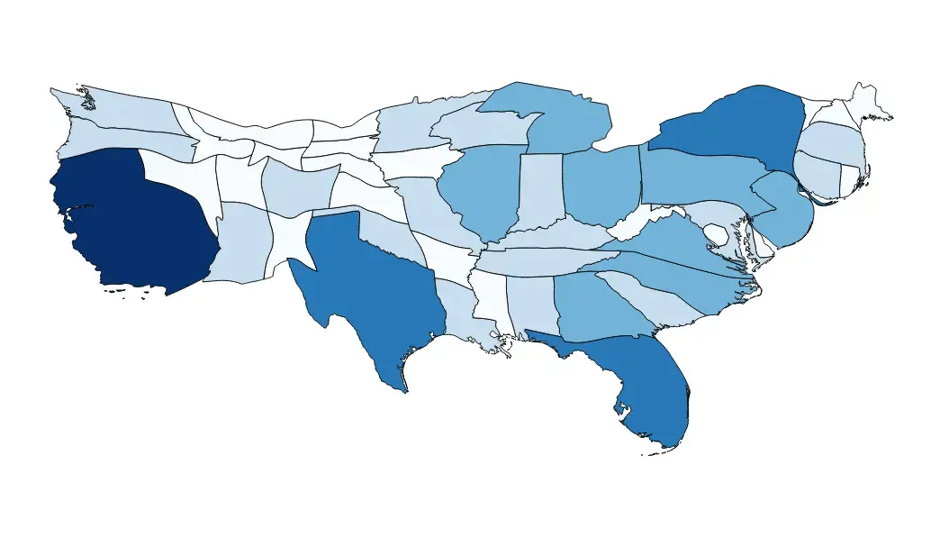
Here is another example that extends the possibility of the data analysis where a derived variable is used to encode color in a map. In this case, Hardship of Living in the US is derived from six underlying data points 1. Education, 2. median household income, 3. unemployment rate, 4. disability rate, 5. life expectancy and 6. obesity. It is a different story if these six parameters really define the hardship of living. But, staying to our purpose, here is a map that provides a picture of hardship across the US and you can find the interactive story here.

While color encoding of maps provides a good perspective on the geo distribution of the data point in question and really aids ‘making sense of the data’, there are few underlying challenges especially, if the data is not dispersed enough. Take the classic example of the political party distribution in the US. 
This has not changed in years and has always been Red across major portion of the country, still, the presidents keep changing from both the parties. As we all know, this is to do with the population in the states that decides the number of votes and hence the states need to be redesigned by population and not just the surface area.
Here is an alternative version from the popular data blogging site FiveThirtyEight which by the way takes its name from the number of electoral votes in the US, redefines the state boundaries by the electoral college.

Enter Cartograms, which is nothing but a map in which you get TWO variables to encode data points – Size and Color. Any thematic variable (population, GDP, votes, etc) at a geo location level can be used to define the contours instead of the land area. Obviously, this redefinition would make the map distorted in order to convey the message, but that’s the intent.
Here is another one which tries to correlate GDP and CO2 emission rates across nations. The size of the countries are encoded by CO2 emission rates and the color defines the GDP. The United States and China as primary culprits is clearly visible, so is the minuscule contribution of the African countries.

You can find more cartograms at Worldmapper. As defined by their tag line, ‘mapping your world as you’ve never seen it before’, which is exactly what Cartograms are about.
Footnote: As with every other data visualization choice, the fundamental criteria for picking the right type is on the information need, clarity and purpose and not just fashion.
The Google Charts version of the geo location implementation can be found here.