
In all my experience with Data Analysis, one of my favorite visualization to analyze multi-variate data is Parallel Coordinates (PC). I would even go to the extent of saying this is the most important tool, if not the only tool, in a Data Scientists’s visualization toolkit. Or rather, I always felt it that way.
For starters, here is a good example to begin with on Nutrients.

‘What the heck is this?’ – if this is your first impression on seeing this image, you are not alone. This is the first reaction I got from anyone to whom I showed this first. So, you are not alone. Someone even asked me if this is a screen saver? And for the visualization purists, it would be appear to be an absurd array of colors and lines, violating every information visualization design principle. If it managed to convince the acclaimed visualization expert Stephen Few, then, it has to be really good. After the initial skepticism, this is what he had to say on PC:
The first time I saw a parallel coordinates visualization, I almost laughed out loud. My initial impression was “How absurd”! I couldn’t imagine how anyone could make sense of the dense clutter caused by hundreds of overlapping lines. This certainly isn’t a chart that you would present to the board of directors or place on your website for the general public. In fact, the strength of parallel coordinates isn’t in their ability to communicate some truth in the data to others, but rather in their ability to bring meaningful multivariate patterns and comparisons to light when used interactively for analysis.
What makes PC stand out is what I call the ability to provide multiple answers in a single visualization or rather to cater to the exploratory need of data analysis. End of day, data analysis is about providing answers to questions and PC does an amazing job of visualizing the correlation between multiple variables in a single visual. Hence, the applications of the visualization stands out in Science and Research areas or in my experience, this is a perfect tool for visual story telling.
Inside the complexity of the visualization lies its simplification and power.
I guess the challenge that PC faces is due to our preconceived notion on what Line graphs always mean. Lines are predominantly used to encode changes in a variable, most commonly over a period of time. The slope of the line encodes the delta in the variable over a period of time.
But in a PC, the lines do not represent change and instead connect and show the effect of how the values of one variable is linked to the other. Each vertical axis represents a variable and each of the variable can have their own units of measure and it doesn’t mess up the axis scales. And, most often in a multi-variate analysis, the information is concentrated in the crossings from one variable to another. This helps analyze some complex variables and the influence of one on the other.
Thanks to some powerful Javascript features, we have some wonderful implementations of PC that make getting data insights even more fun and powerful. For example, here are some inferences from the Nutrient Explorer.
What are some high protein diets?
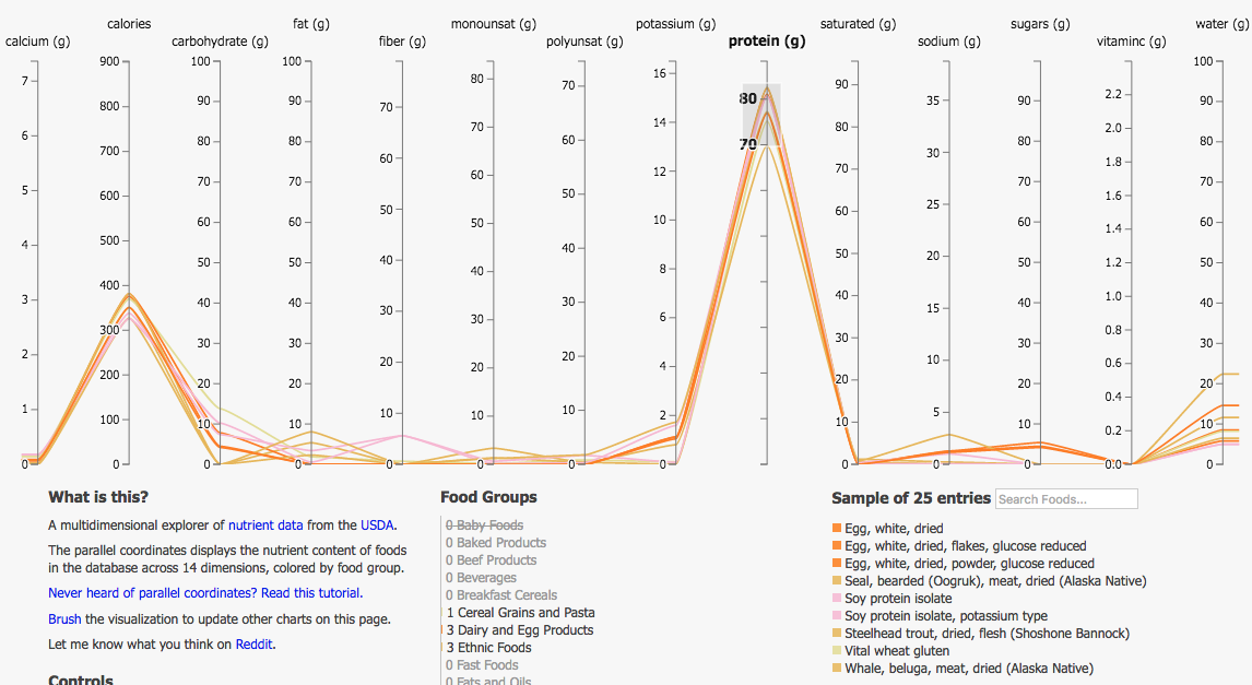
It doesn’t just give you just the list of high protein foods, it also gives you a perspective on the other nutrients in a high protein diet. In this case, they are very low on Fat sugar and fiber.
What are some high Carb diets?

They all seem to have very high sugar content as well. The aggregation of purple colored lines tells you a message that majority of the high Carb diets are Breakfast Cereals and the second highest is Baked products. Wait a minute, I see a line with very high Vitamin C, what is that?

It turns out to be a fruit flavored drink, powder or orange juice.
Look at the number of answers you are able to get in a single visual. I guess, now you see the power of PC. The possibilities are endless, especially for a curious mind.
One of the key criteria of success for conveying a powerful and insightful story with PC, is picking the right variables that is relevant to the problem domain. As you keep mining, looking for the elusive insight to validate your hypothesis or correlation, you should be able to add or discard variables to your hypothesis. This is the true essence of Data Science and that is why I feel PC is the best (if not the only) tool for Data Science.
More insights on the usage of PC in the next blog.